
MUNCH!
AI-powered meal planning & grocery budgeting made easy for international students in Vancouver.
TEAM PEPE.PNG
Isabella Lian
Joann Vu
Amy Zhao
IAT334 D103
Fall 2024
01.
User Research
Intended Users
Our target audience is international university students living off-campus, alone or with roommates, they share a common challenge, balancing school work while struggling to find the time to prepare nutritious meals.
Identify User Struggles
During this stage, we conducted serveral user interviews and surveys with our target demographic to gain insight on key struggles they face while pursuing their studies in Vancouver.
Connecting with Culture
Lack of Social Support
Using a Second Language
High Cost of Living
Finding Affordable Housing
Tuition Pricing
User Goals
Our research uncovered two user goals that guided our direction.
Maintain healthy balance between lifestyle and finances
Further education and pursue their career
Proposed Solutions
01.
Roommate Finder
Roommate finder to create roommate matches based on personality, lifestyle, cultural practices, and sleep & school schedule.
02.
Scholarship Finder
Centralizes scholarship and financial aid opportunities while also providing AI-driven suggestions to improve application quality, tailored to the specific scholarship based on provided description and requirements.
03.
Meal Planner
A meal planning app that helps users generate recipes, locate and compare grocery stores for cheapest ingredients, and build a weekly/monthly budget.
Chosen Solution
The meal-planning solution was chosen as our direction as it address the prevalent issue of food insecurity while helping international students optimize their limited schedules through simplified and efficient meal planning.
Rationale
According to our survey and countless online testimonies, international students are facing food insecurity due to the rising cost of living in Canada.
"I didn’t know where to shop, what to buy, or even how to cook and I ended up skipping meals more often than I’d like to admit. I was essentially living on instant noodles, which were neither healthy nor sustainable"
— Kapish Chhabra
Feasibility
AI will be used to generate and provide highly rated, authentic recipes sourced from the internet. Updated pricing data from major grocery store websites will be used to provide accurate budget estimations, making meal planning both practical and cost-effective for users.
02.
Wireframing
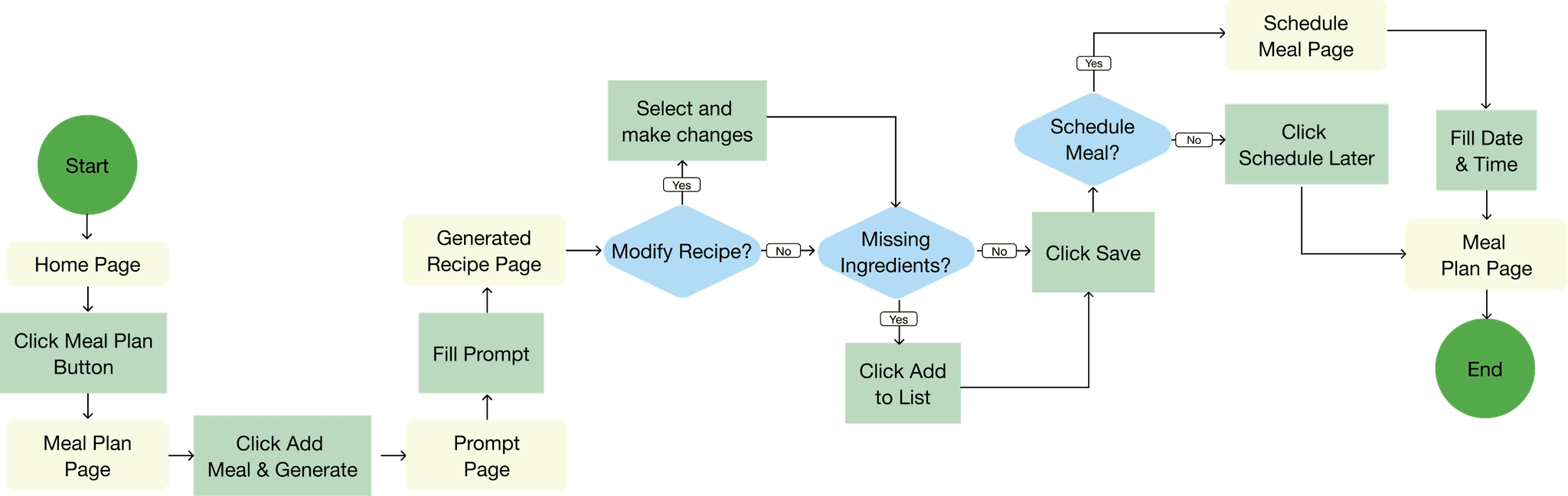
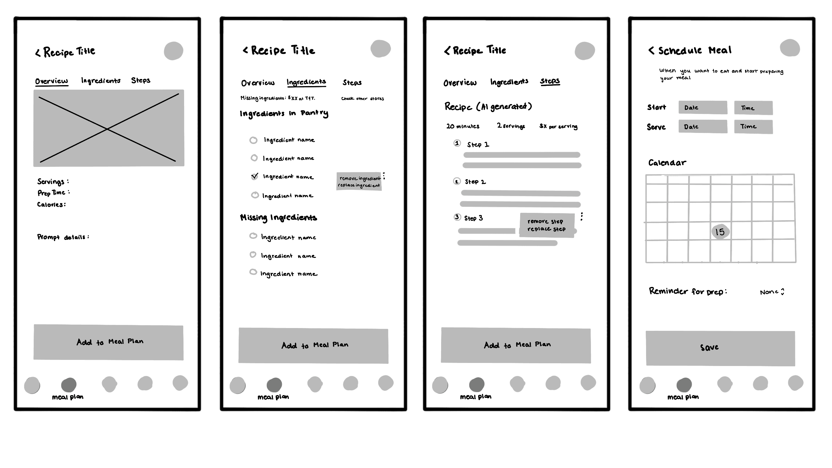
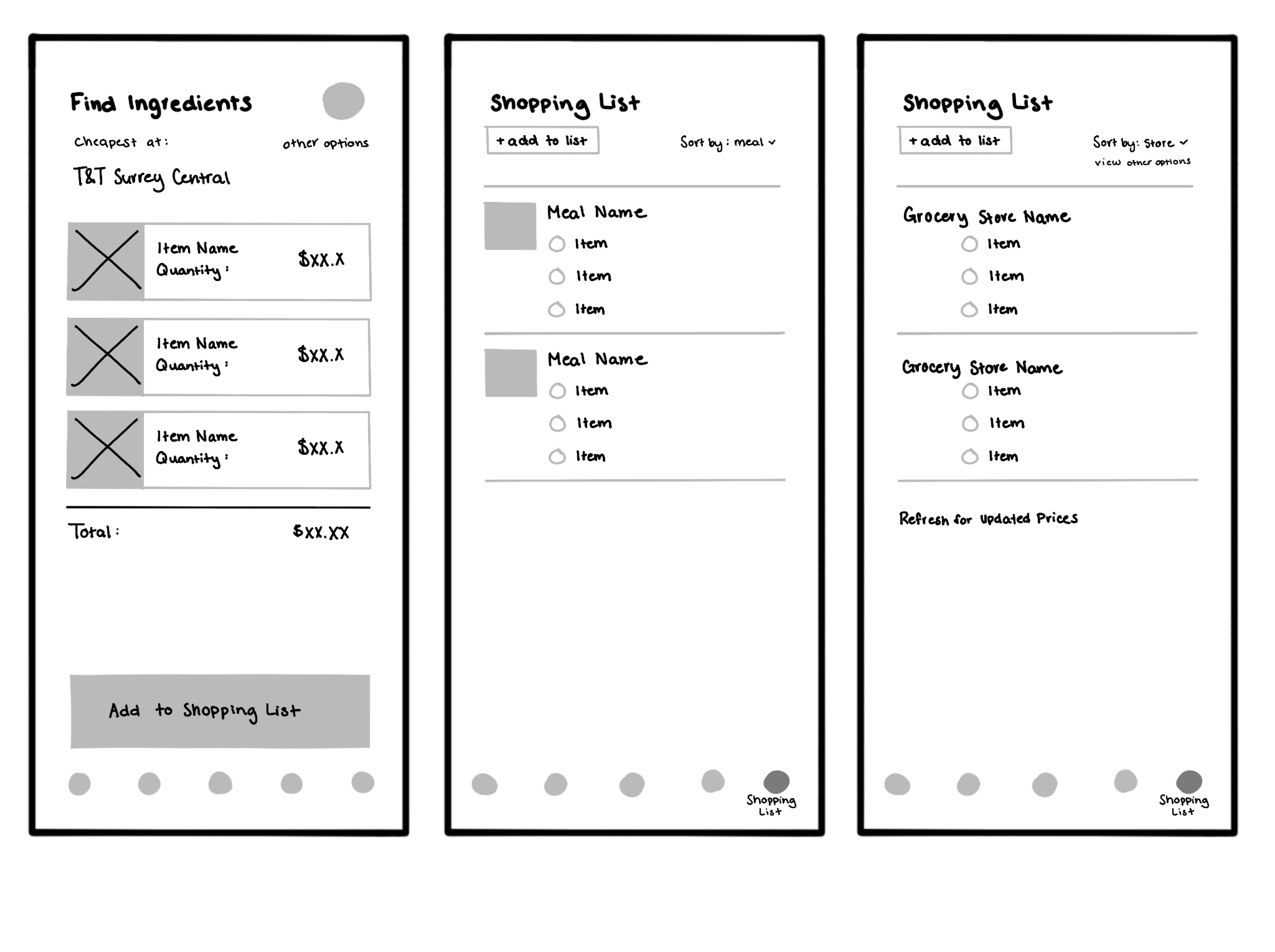
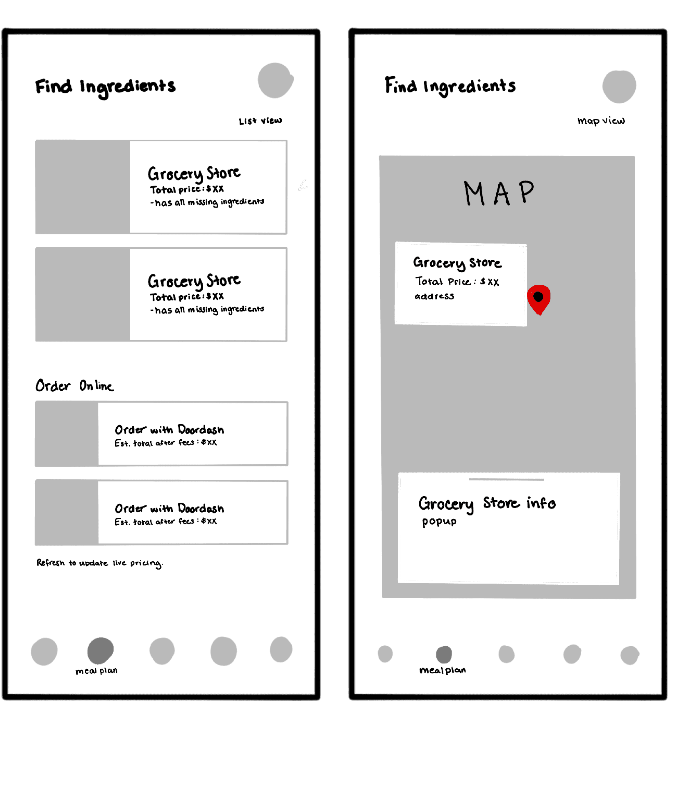
Task Flow
The task flow for the recipe generation, meal scheduling and adding to grocery list features that was used as the basis for our initial wireframes.
Proposed Features
Features
AI meal generation
Budget Management
Meal Scheduling
Onboarding & Preferences
Interactive map with grocery stores and pricing
Grocery list
Feature Goals
Help students manage their finances
Help students improve their cooking skills
Support health and well-being
Convenience and accessibility locating ingredients
Simplify meal planning
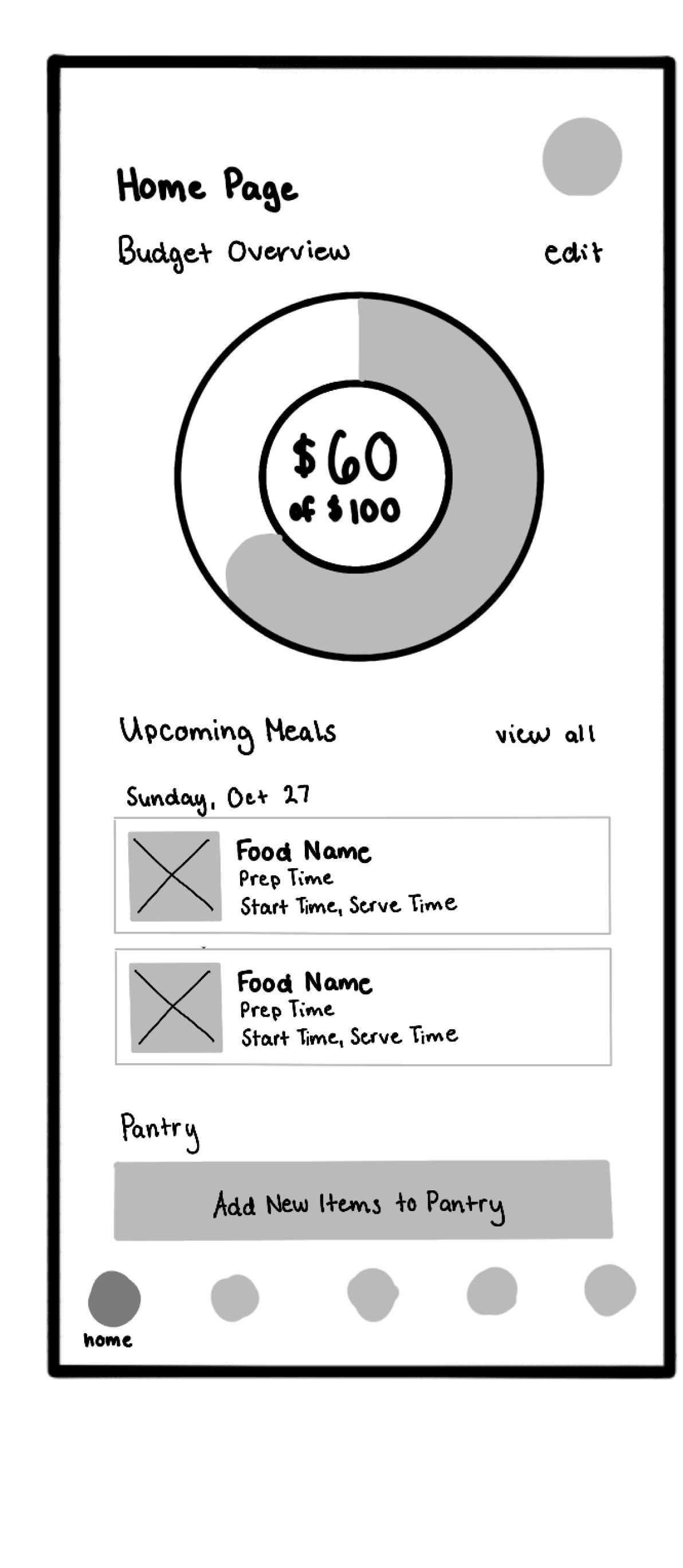
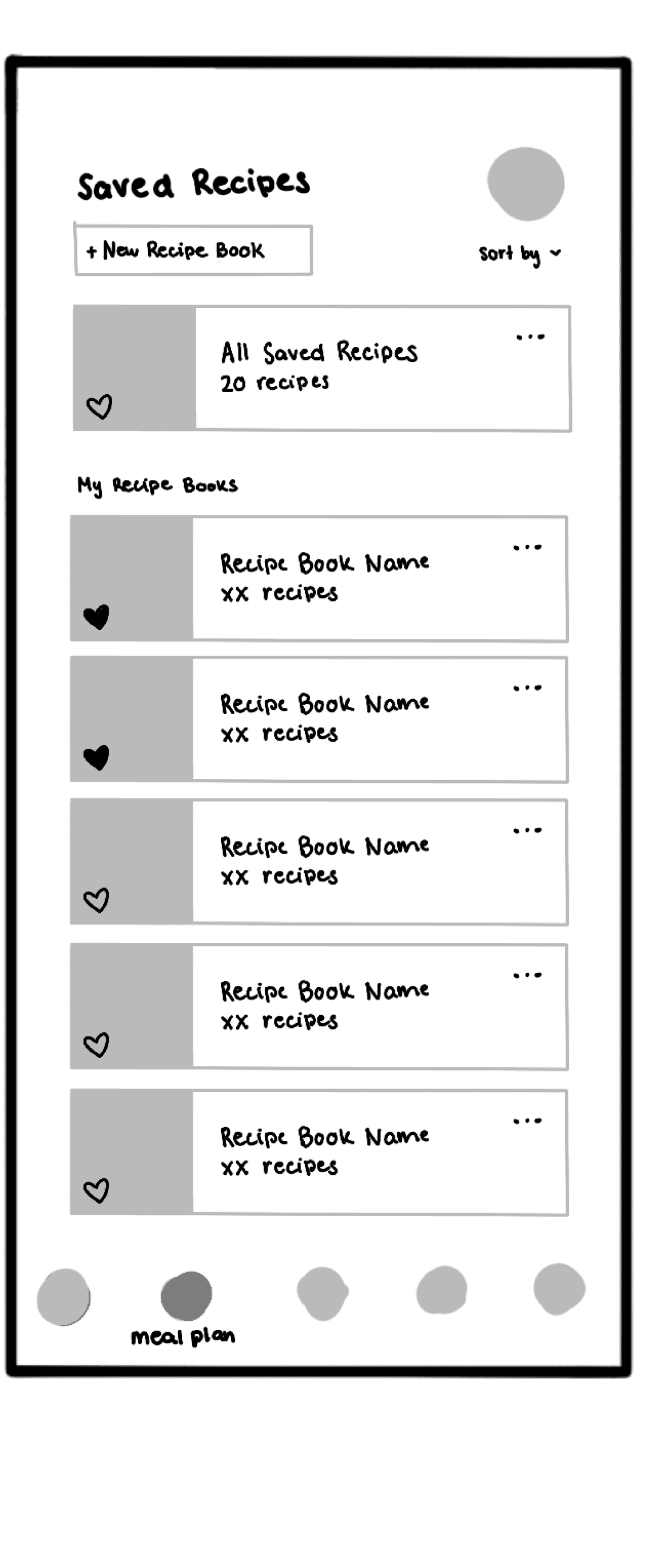
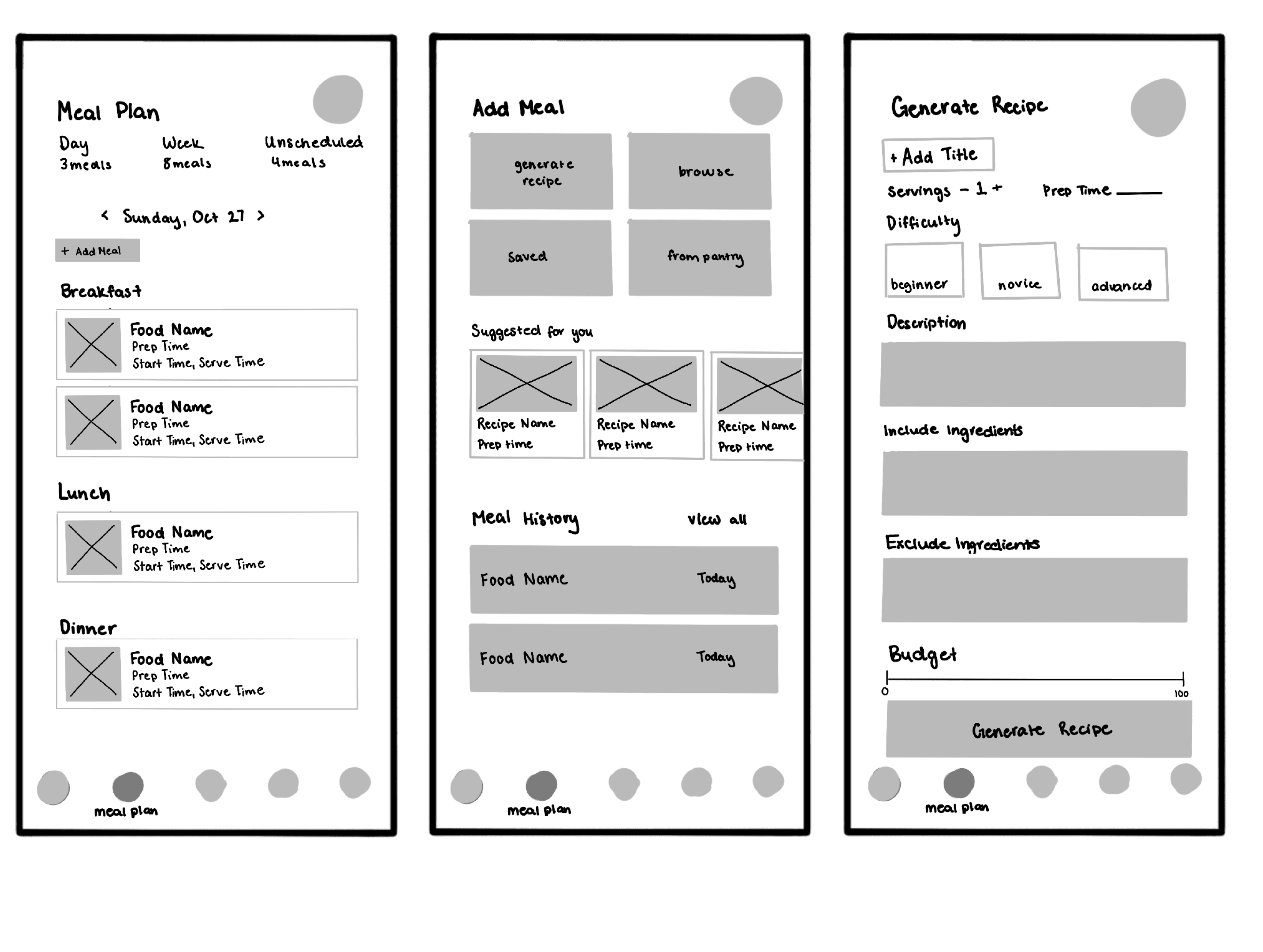
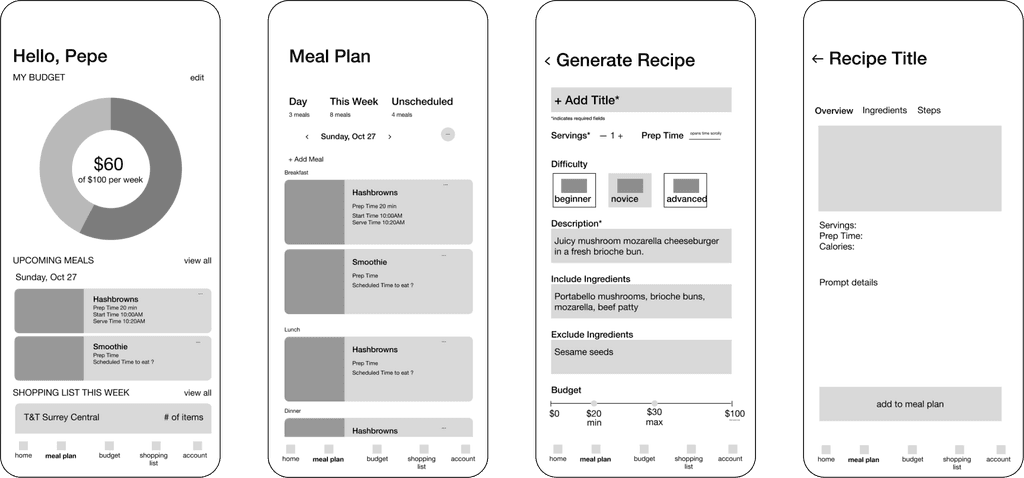
Wireframes
03.
Design Direction
Following our sketched wireframes, we developed three distinct design directions for Munch! to explore different visual designs and identify which option had the most effective user experience.
Interaction Path
Our 3 design variations all follow the interaction path of the app’s main feature, AI meal generation and adding recipes to the meal plan. The initial wireframes of this path are shown below.
Design Divergence
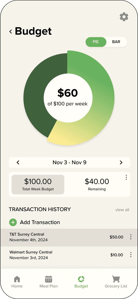
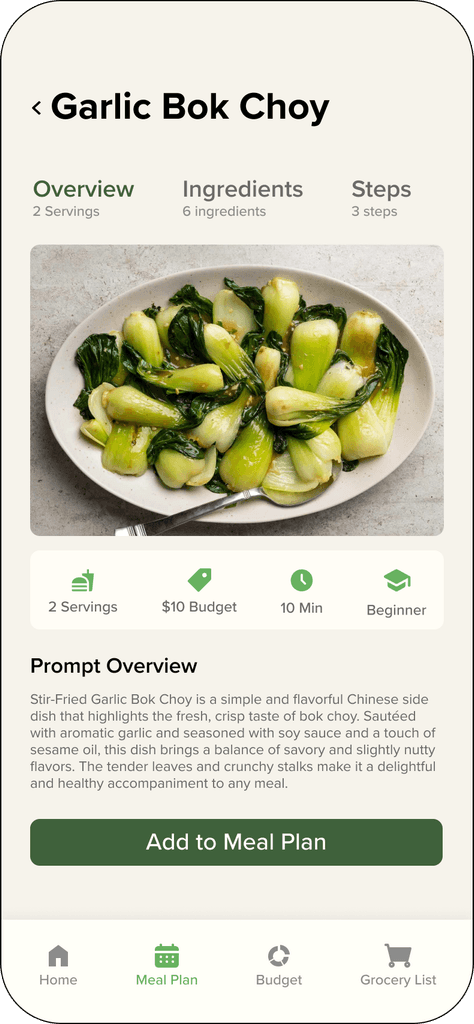

The green and off-white colour palette of this direction reflects positive financial relations and health. Elements are presented in horizontal card layouts to condense and organize key information
Proxima Nova Font Family
Direction 1
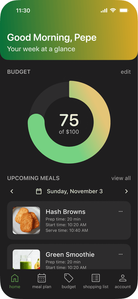
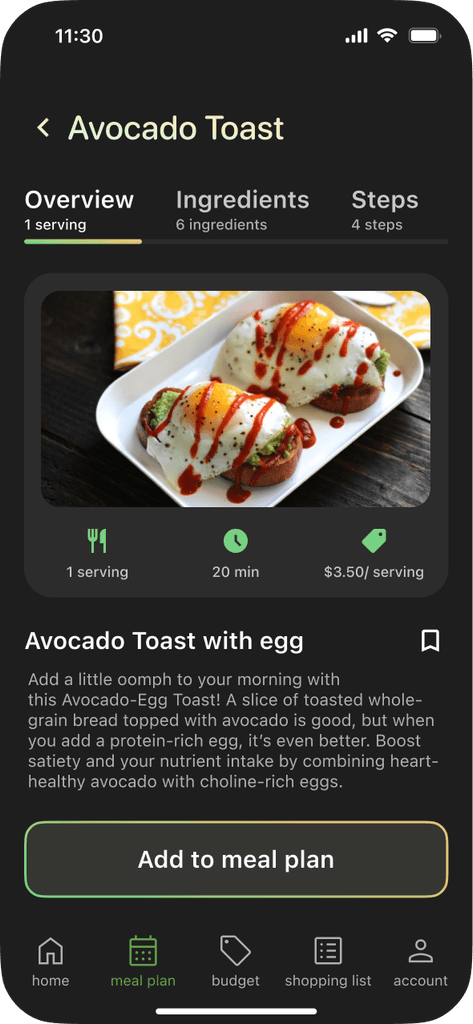
A dark grey background reduces eye strain and provides higher contrast. Green and yellow gradients to represent a welcoming digital environment & harmonize with the colours of food photos, and buttons are outlined for distinction
SF Pro Font Family
Direction 2

A bright colour palette promotes positivity, suited for healthy lifestyle and meal planning.
Off-White cards to help differentiate elements from background. High affordance icons provide instant recognition, helping minimize language barriers for international students
SF Pro Font Family
Direction 3

Chosen Direction
Ultimately, we decided to continue with Direction 1 for its bright and simple colour scheme, its simple and straight-forward layouts that align with precedent meal planning and finance management apps and usage of high-affordance icons and clear images.
Direction 1
04.
Testing & Refinements
User Study: Phase 1
After completing the initial prototype, we conducted a user study with participants testing the app. This helped us gather valuable insights for necessary improvements and guide the app's development. A first round of user tests to identify areas for overall improvement followed by a second round that incorporated the suggested changes to gain deeper insights into key pain points.
Overview
In Phase 1, international students living off-campus were asked to test our initial prototype before, during, and after meal preparation. Users were assigned tasks to evaluate the app’s user experience. This included completing the onboarding process by setting a budget and selecting desired cuisines, generating meals, adding to the meal plan, and using the app’s recipe instructions during meal preparation. Users were asked to mark the meal as complete and search for the items in their grocery lists.
Methods
Users were tested both in-person and over video call. Participants were asked to do a think-aloud walkthrough, letting us understand how users really felt about our designs. Participants were asked to complete specific tasks and free-explore.
Issue Analysis
Participants in the user study identified several usability issues in the initial prototype, which we addressed by implementing targeted improvements.
The search bars alone in Onboarding may confuse users and increase the cognitive load to set their preferences and restrictions.
→
Provide suggestions that accompany search bars so users can recognize and contextualize the information requested by the interface
Ambiguous word choices throughout our app can be difficult, especially for international students who are ESL, to understand.
→
Changed wording to be direct in their meaning. For example, “Add Transaction” was changed to “Add Grocery Visit”, “Budget” in onboarding was changed to “budget goal”, and “tolerance” was removed.
Large chunks of text in Recipe Instructions can appear uninviting and intimidating, making finding specific steps difficult.
→
Subheadings to break up chunks of text within the Recipe Instructions page. This reduces the cognitive load of finding specific steps.
Inconsistent capitalization and spacing makes navigation more difficult and makes content appear disorganized.
→
Internal consistency standards are used and maintained throughout the apppliction.
Phase 1 Refinements
Onboarding
Allergy & Dietary restriction suggestions of common allergies
Common cuisine suggestions with icons to provide an affordance and set a precedent
Visual representation of the user-generated weekly budget divided into a daily budget
Budgeting
Language adjusted to align with intended users’ expectations
“Add transaction” → “Add Grocery Visit”Changes in spending are reflected in the Budget and Home pages
Branding
Logo redesigned to better reflect the app function
User Study: Phase 2
After implementing the suggested improvements from Phase 1, we invited the same participants to test the newly refined prototype, following the same task flow. Additionally, we had a new user test the app to provide a fresh perspective and ensure unbiased feedback on the app. This phase had focus on identifying heuristic flaws in our design.
Issue Analysis
Phase 2 of our user study revealed three prevalent user experience issues during participant testing, which entailed proposed solutions to be implemented into our final prototype.
User control and freedom can feel limited due to the lack of properly implemented exit or undo functions.
→
Implement undo/redo functionality across all modifiable areas, such as recipe ingredients, steps, and grocery lists, to reduce the effort required to reset changes.
The app can feel overwhelming and difficult to navigate due to the excessive amount of information presented.
→
Organize recipes into collections to increase efficiency when looking for a recipe.
Inconsistencies with interactive components such as buttons, make the experience complicated particularly for first-time users.
→
Add swipe navigation between tabs, replacing header clicks, to align with common interaction conventions. An animated sliding bar enhances clarity and reflects the swiping action.
The Challenge
Design and prototype an AI-Powered smartphone app to support the studies of international students in Vancouver. Our goal was to provide a solution that simplifies meal planning and budgeting to help students maintain a healthy balance between nutrition and studies.
Our Approach
01.
User Research
Conduct user studies and interviews with international students to understand their struggles and create our design domain & propose solutions
02.
Wireframing
Create sketched wireframes of proposed features and user interactions
03.
Design Direction
Propose and mock up different interaction paths and design directions
04.
Testing & Refinements
Pilot user studies and make refinements based off of user feedback
05.
Interactive Prototype
Create a polished final interactive prototype
05.
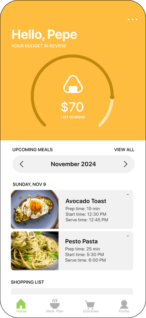
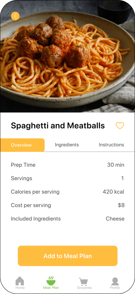
The Final Prototype
Ready to start munching?
Watch the full video walkthrough or